Case study - Product design
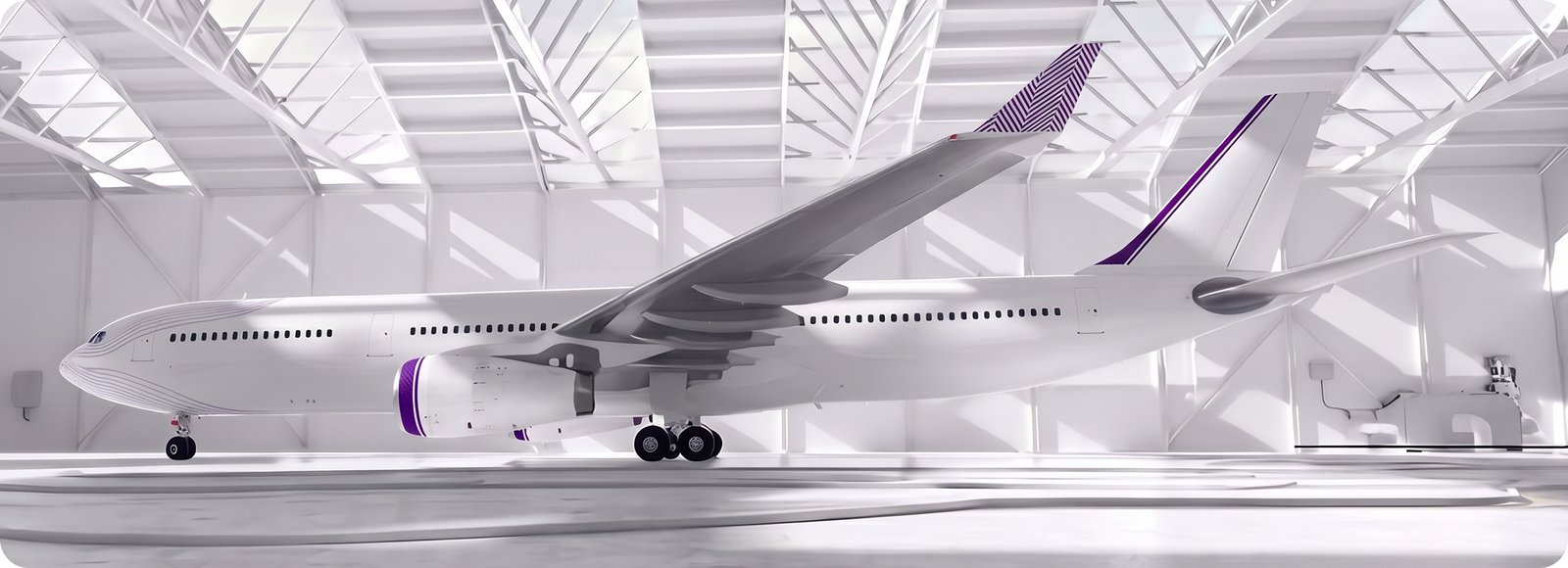
Kiu Flight e-commerce
Redesigning an airline booking flow so travelers can find, compare and pick flights with confidence.
Redesigning an airline booking flow so travelers can find, compare and pick flights with confidence.
Booking flow completion rate after launch
About flight selection after the redesign shipped.
On key elements like the “Continue” button and stopover filters.
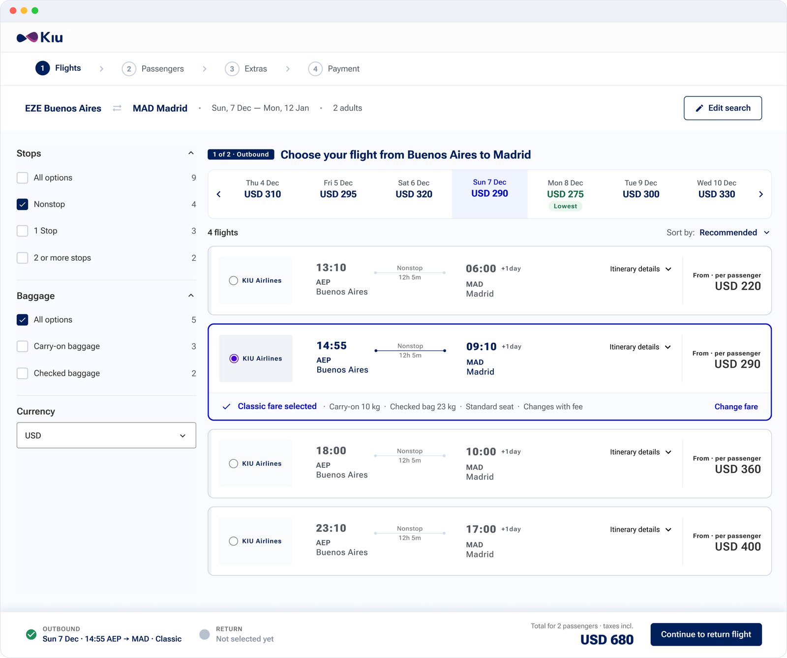
Kiu sells B2B software that powers booking, check-in and ticket purchase for airlines. Its booking experience looked outdated, wasn’t responsive, and parts of the flow were confusing. Travelers said so in app store reviews, and analytics showed critical drop-off points right where they had to choose a flight.
Product Designer, end to end: research, UX and UI design, usability testing, dev handoff and QA after launch.
I worked with Kiu’s developers through handoff and with QA to compare the live product against the specs.
Technical limits ruled out deep structural changes, so the information architecture and the core flow had to stay.
Not every wireframe, just the turning points: what I decided, why, and the trade-off I accepted.
Redesign the full booking flow, from search to confirmation, and start with Search and Results, where the problems were biggest.
Analytics showed the sharpest drop-off and the highest cognitive load in flight selection. Fixing it first set the patterns every later step reused.
Technical limits kept the information architecture in place, so I improved every step within the existing structure instead of reordering it.
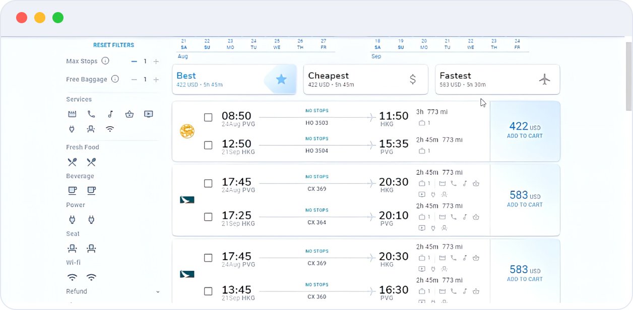
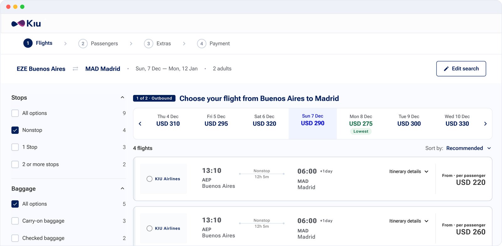
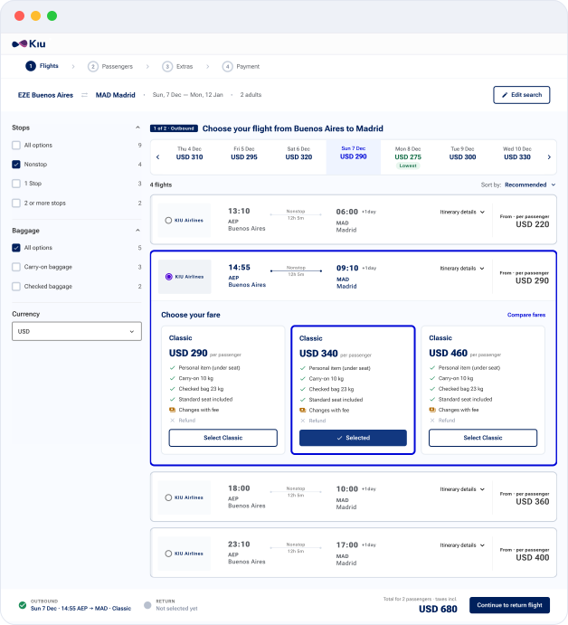
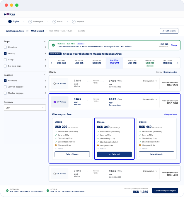
Split flight selection into an outbound step and a return step, each with its own clear control.
Legs couldn’t be combined freely, which broke user control and freedom. Rigid selection was a recurring complaint.
One more step in the flow. In exchange, each decision is smaller and the chosen outbound stays summarized on top.
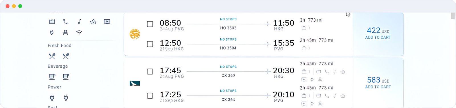
Group side icons by category (services, meals, seats, Wi-Fi) with tooltips, and give schedule, airline and price the strongest type.
Rows of unlabeled icons created ambiguity, and flat type sizes made every detail compete for attention.
Secondary details moved behind tooltips and expandable fare cards: one tap away instead of always visible.
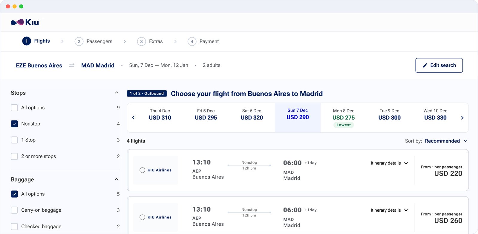
I ran a remote usability test with 6 participants with basic or intermediate experience buying flights online. Most completed the flow, but two issues stood out.
couldn’t clearly tell which flight they had selected: only a small radio button marked it.
had trouble finding the “Continue” button.
“Did I already select it? I’m not sure if this is the one I picked.”
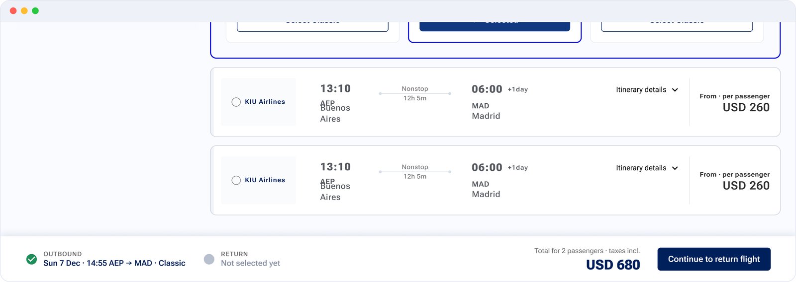
Redesigned radio buttons and an outline around the selected flight card, so the choice is obvious at a glance.
A colored bar with a larger button keeps the main action and the running total always in view.
The sticky bar takes permanent space on screen. I kept it compact: price, selection summary and one button.
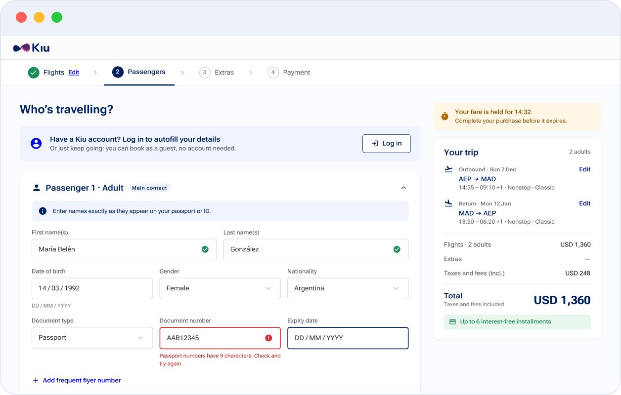
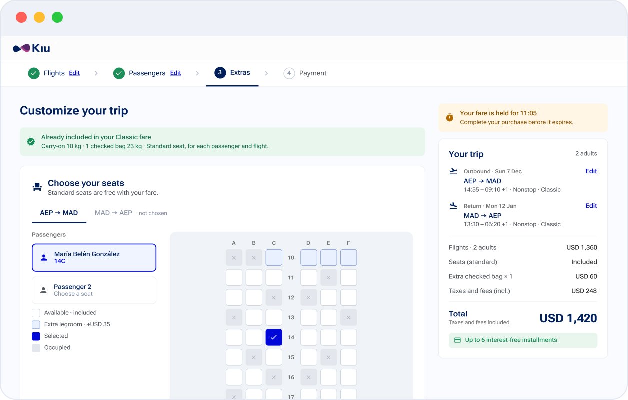
Reuse the stepper, cards and trip summary from passengers to confirmation, built on one component library.
Visual consistency across the whole flow was a design goal, and one set of components gave developers one set of specs.
Guest checkout is the default and login is optional: less account data up front, one less reason to drop.
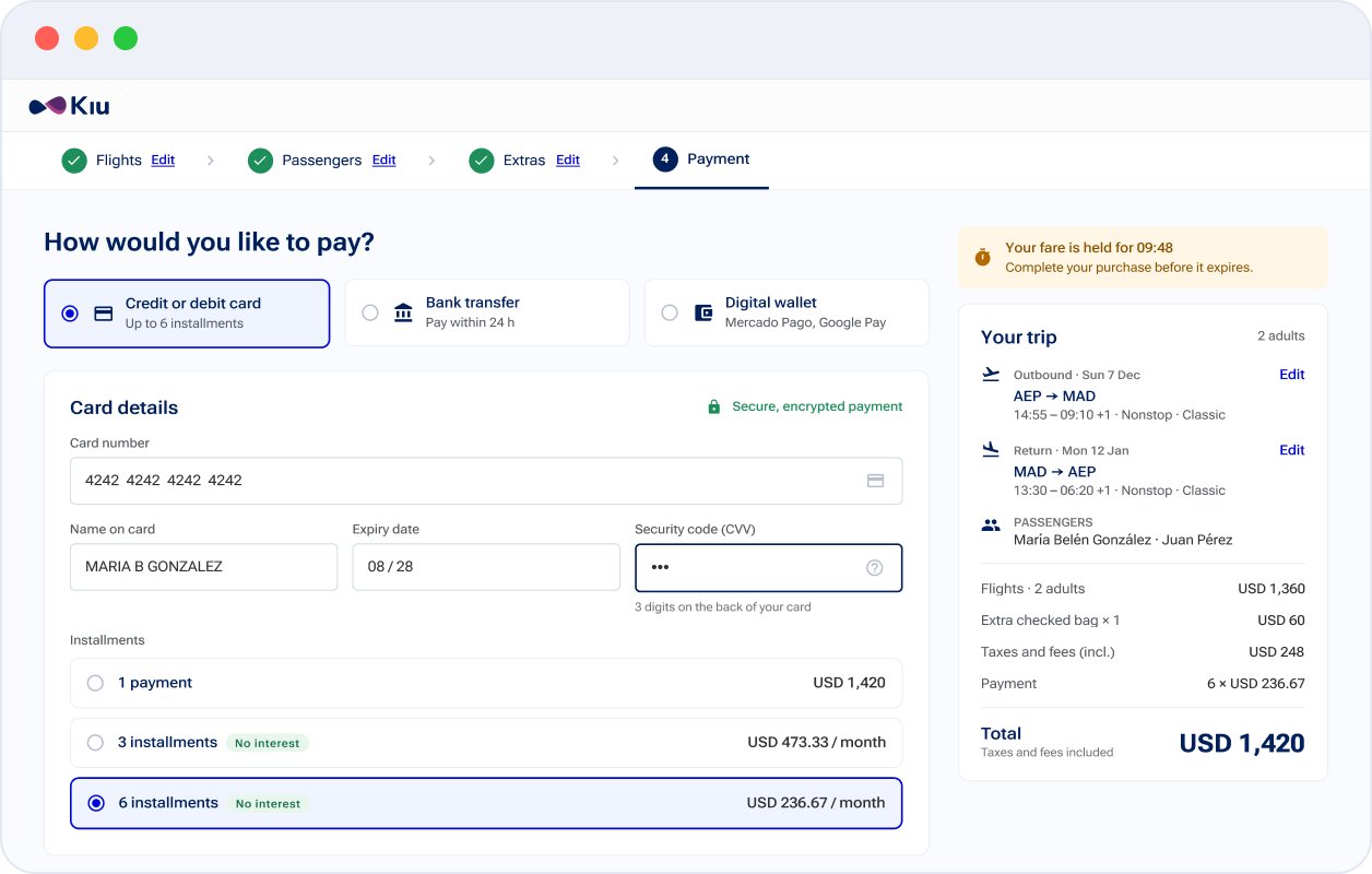
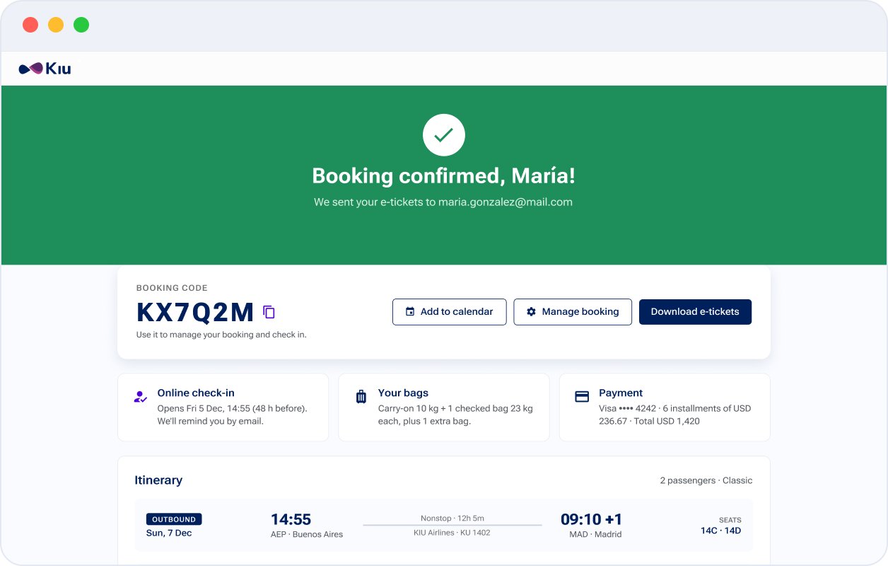
Also designed: edge states for a declined payment, a price change and an expired fare hold.
Booking flow completion rate
Tracked after launch as part of post release monitoring.
About flight selection.
On key elements like the “Continue” button and stopover filters.
Not being able to rebuild the structure forced me to fix the pages with the most impact first.
A radio button was “correct”, but 40% of testers still doubted their choice. Selection needs a visible state change.
A small remote test surfaced the two issues I fixed in round 2.
Design mobile versions of flight selection, passengers and payment, so the new flow works as well on a phone as on desktop.
Validate Basic, Classic and Flex with a clickable prototype: do travelers understand what each fare includes?
Once technical limits allow, tackle the structural issues that this phase had to leave out.